PROJECT
UX/UI Web & Mobile | Branding
TIME
March 2023 - Jan 2024
UCSF Eureka Research Platform

UCSF’s Eureka Research Platform was designed to make participating in medical research studies accessible to people of all ages, anywhere and anytime.
I was the only and primary UX Designer for Eureka Platform’s 16+ medical research subsites and the Eureka mobile app, cross-collaborating in a team of 20. Additionally, I developed branding and graphics for medical research study teams.

When I first joined the team, I thoroughly analyzed the existing product and its many external and internal websites, including the mobile app.
HOW IT WORKSThe user experience called on users to go through a series of module-like surveys to participate in their enrolled medical research study. Depending on eligibility, some users could enroll in more than one study. Users are awarded points for the number of surveys completed.
THE PROBLEMS.
Stakeholder, participants, and I identified some core problems in the user experience:
Users were confused about which studies, if any at all, Eureka was associated with.
The mobile and web user experience were drastically different (the mobile app was not accessible)
The number of duplicate accounts was gradually increasing, and participation rates were dropping
There was also always the looming concern that my team and I often discussed with stakeholders and other medical research studies affiliated with Eureka:
How can we incentivize user engagement and participation? How do we keep users participating in their enrolled medical research studies?
THE SOLUTIONS.
Universalizing the Eureka brand and user experience across web and mobile
Improved onboarding experience, which user research proved was the cause for the majority of duplicate accounts
Created a global design system that made web and mobile experience accessible
RESEARCH.
The Eureka Research Program is the first of its kind in medical research–it’s the first to make participation in medical research studies readily accessible via web and mobile.
Eureka’s uniqueness means there is no direct competition for competitive analysis, so I tried finding user experiences that mirrored aspects (ie. features, navigation, user flow, etc.) Eureka already had.
02. Updating the Onboarding Process
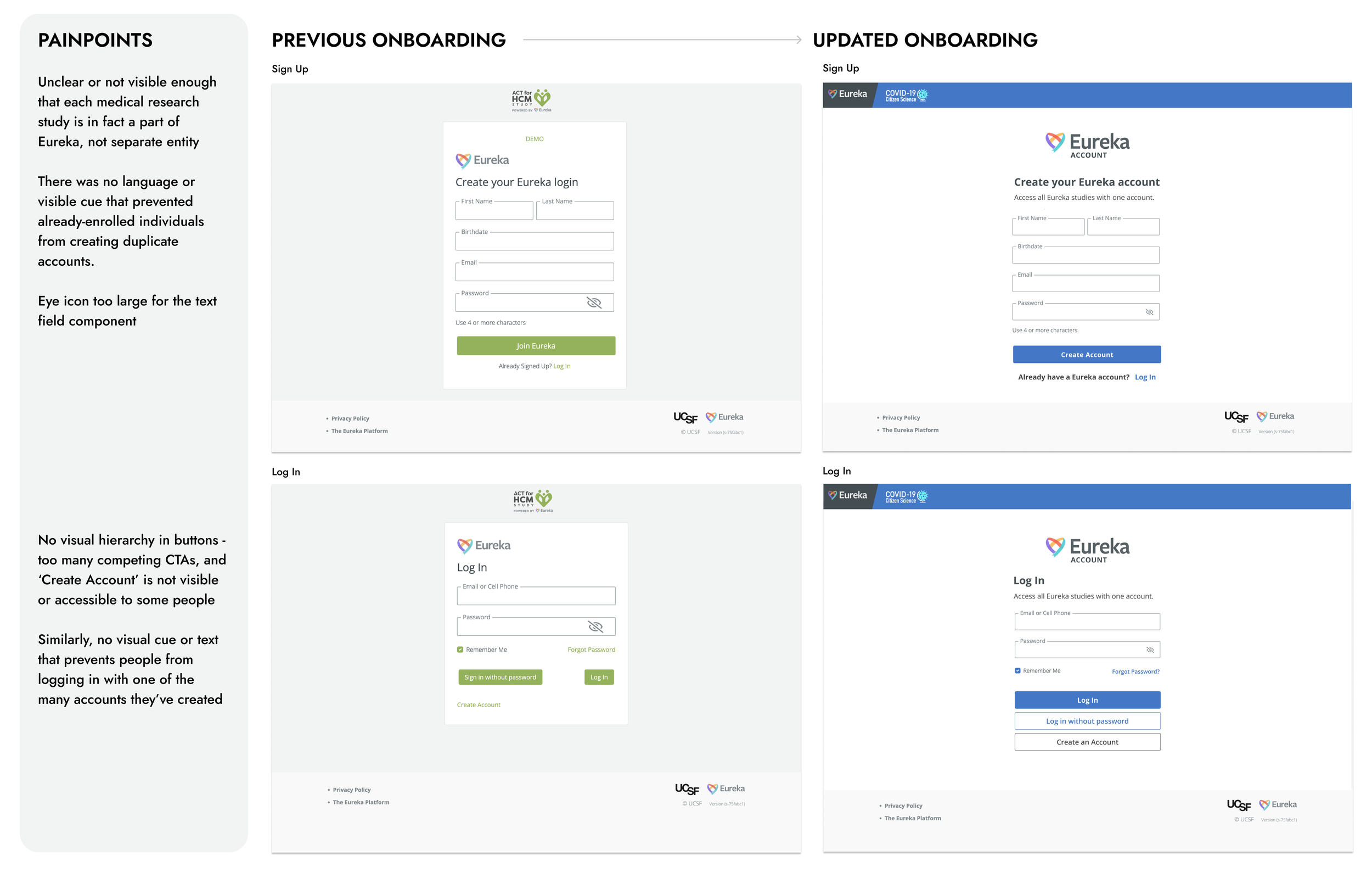
PROBLEM
There are too many duplicate accounts. The average user thought they needed to create a new account for each research study they participated in when in reality, users only need one account to sign up and participate in multiple studies.
SOLUTION
Implement a static Eureka-study banner for clarity that all studies are a part of Eureka
Add text that implicitly tells users to use one account
Fix UI components
The Key
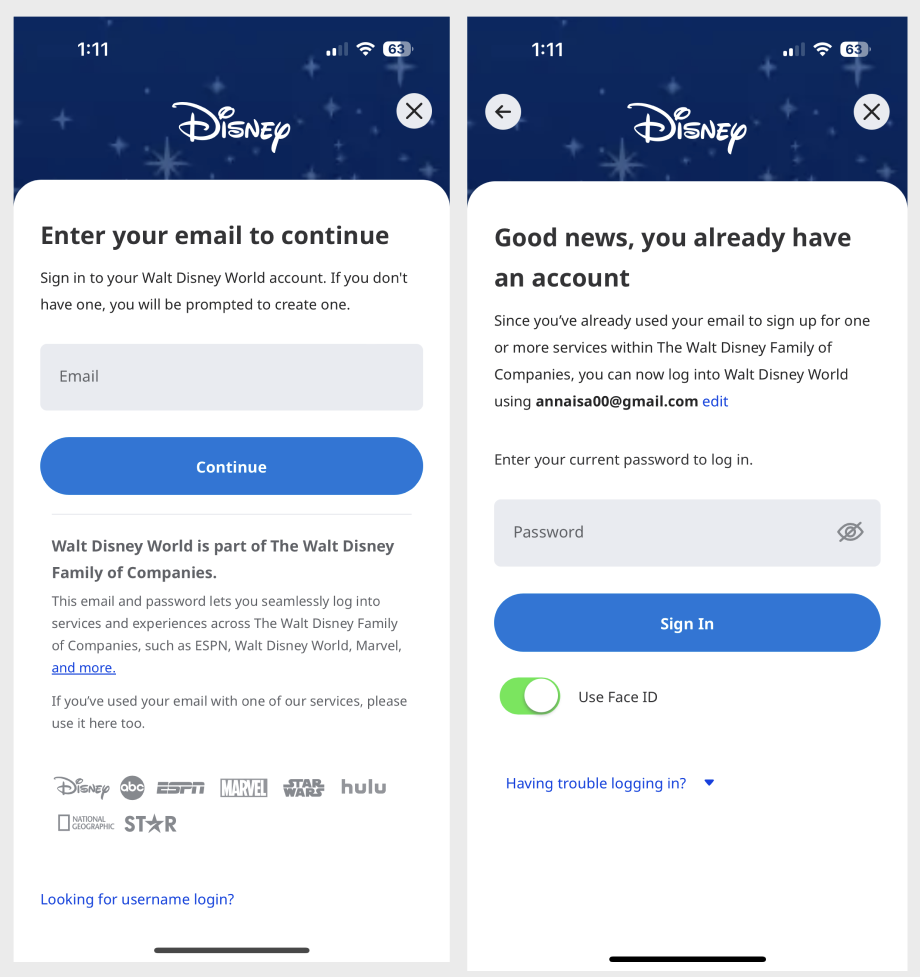
Like Eureka, Disney has many subbrands. Their onboarding is the same across all of their brands — this was the key solution for Eureka who also has subsites affiliated with it.
Eureka needed a global onboarding process for all subsites.
Limitations
Upon speaking with our developers I came to understand that we did not have the bandwidth (time and money) to implement something like this due to backend complications and the timely process.
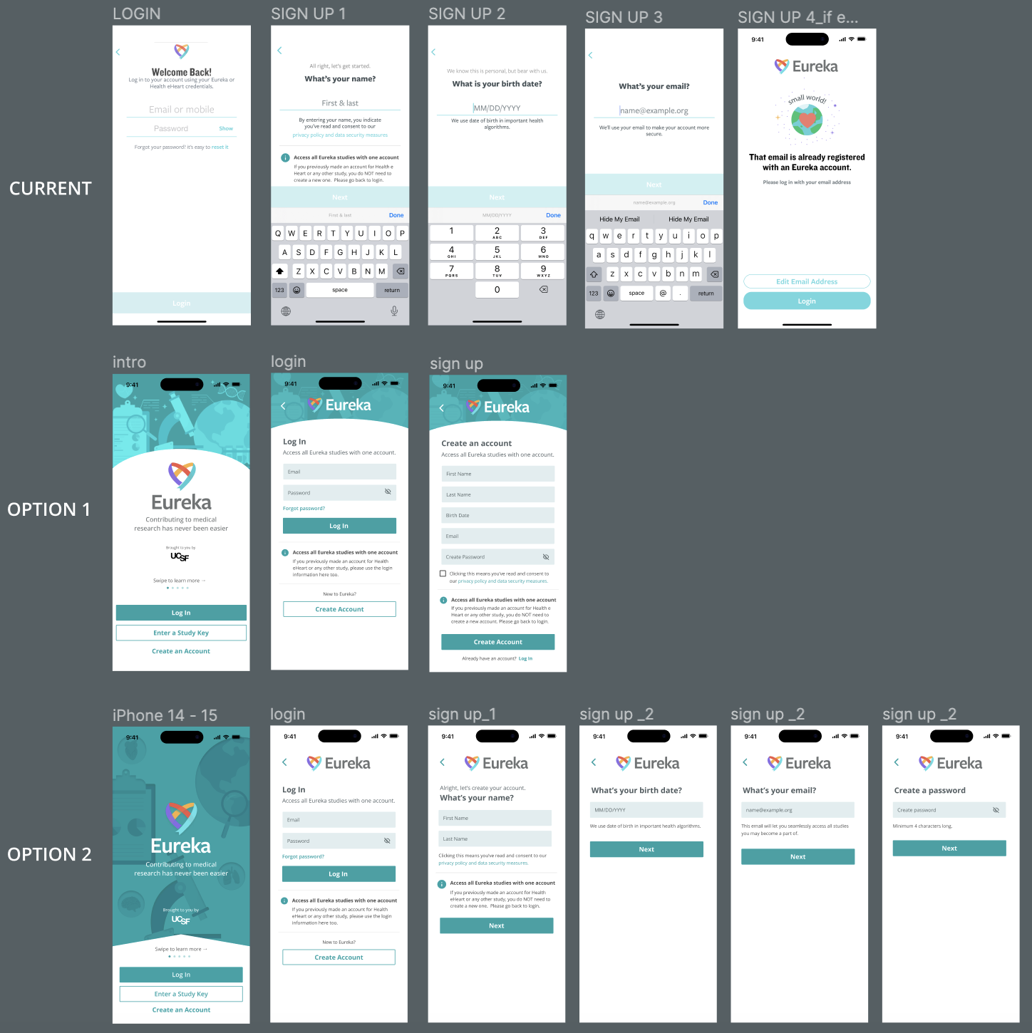
Mobile Solution
The majority of our users participated through their mobile devices. I applied most of the edits on the web to our mobile interfaces.
Result - 30% less duplicate accounts.
03. Making Dark Mode Accessible
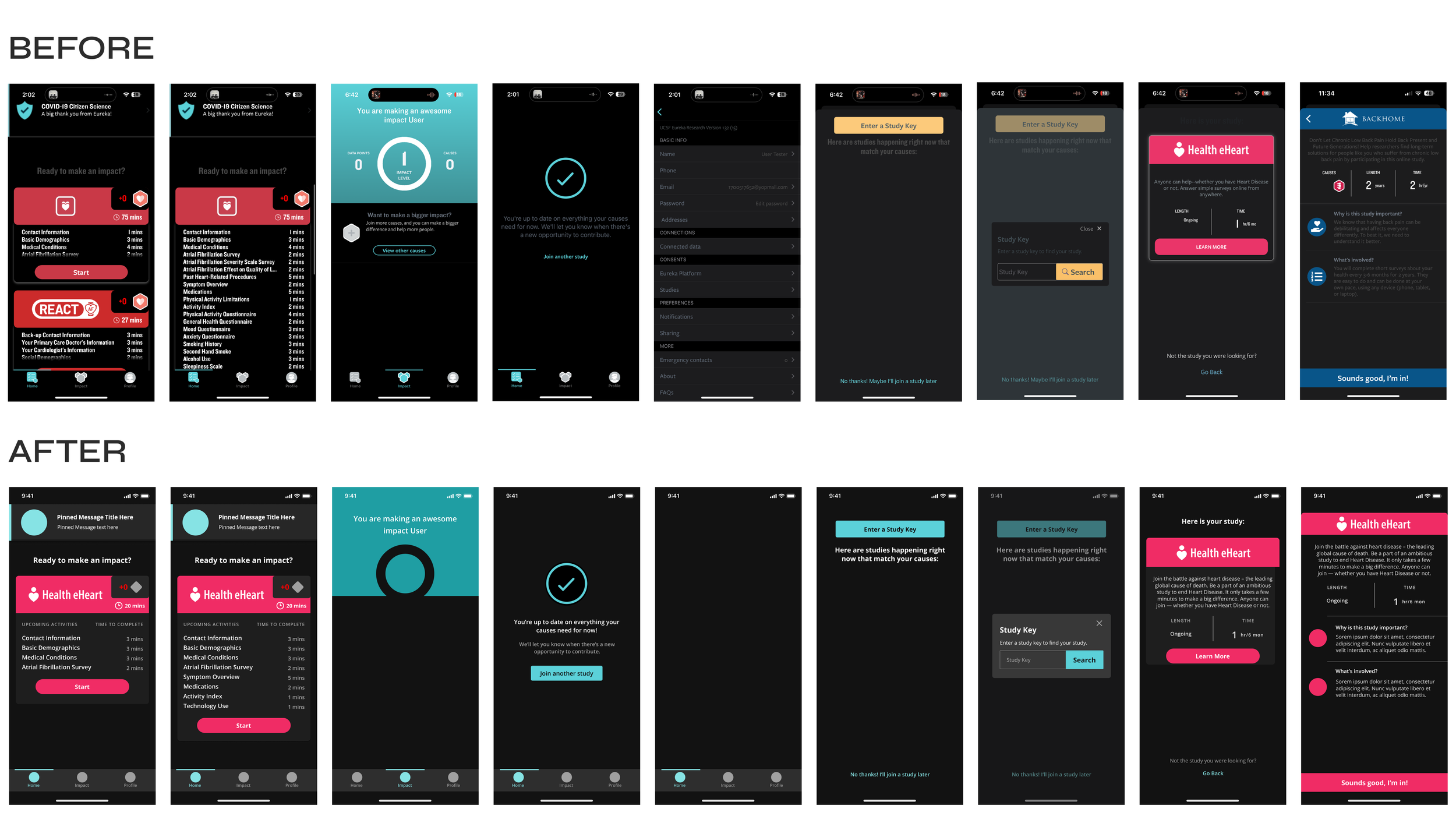
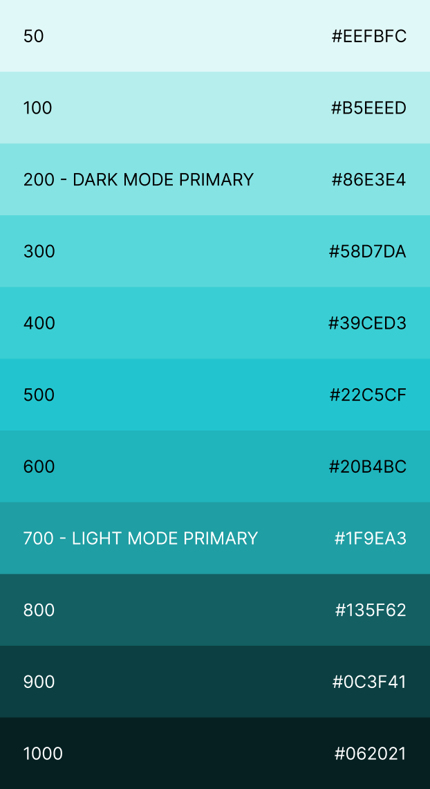
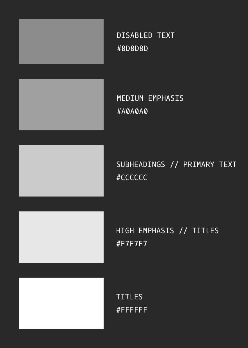
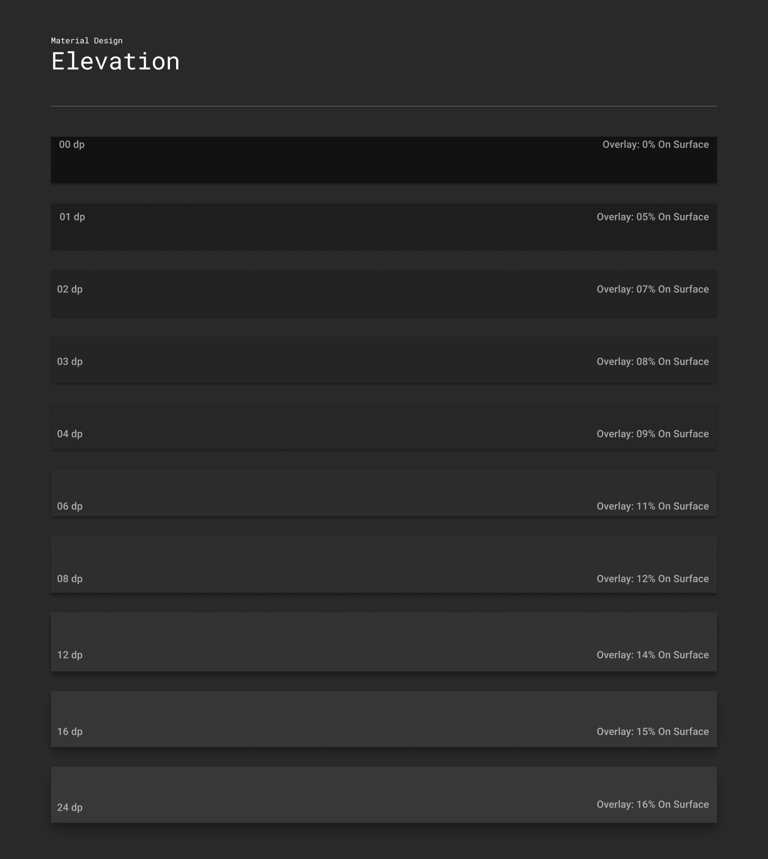
Dark Mode on iOS was not accessible to users. I created a WCAG-compliant Dark Mode design system for developers to implement across mobile.
PROBLEM
Most components and text were not accessible (not legible)
Visual hierarchy was not present due to low color contrast
SOLUTION
Developed a global color system for Dark Mode for UI components, text, and elements
02. Universalizing the Eureka Brand
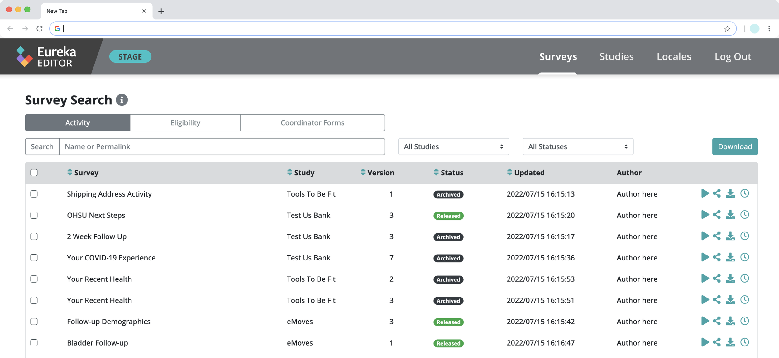
Eureka’s backend study-builder tool platforms are available to Eureka employees, Research staff, and Research Studies.

Before
No visual indicators for users to know research studies are part of Eureka.

04. Research Study Branding
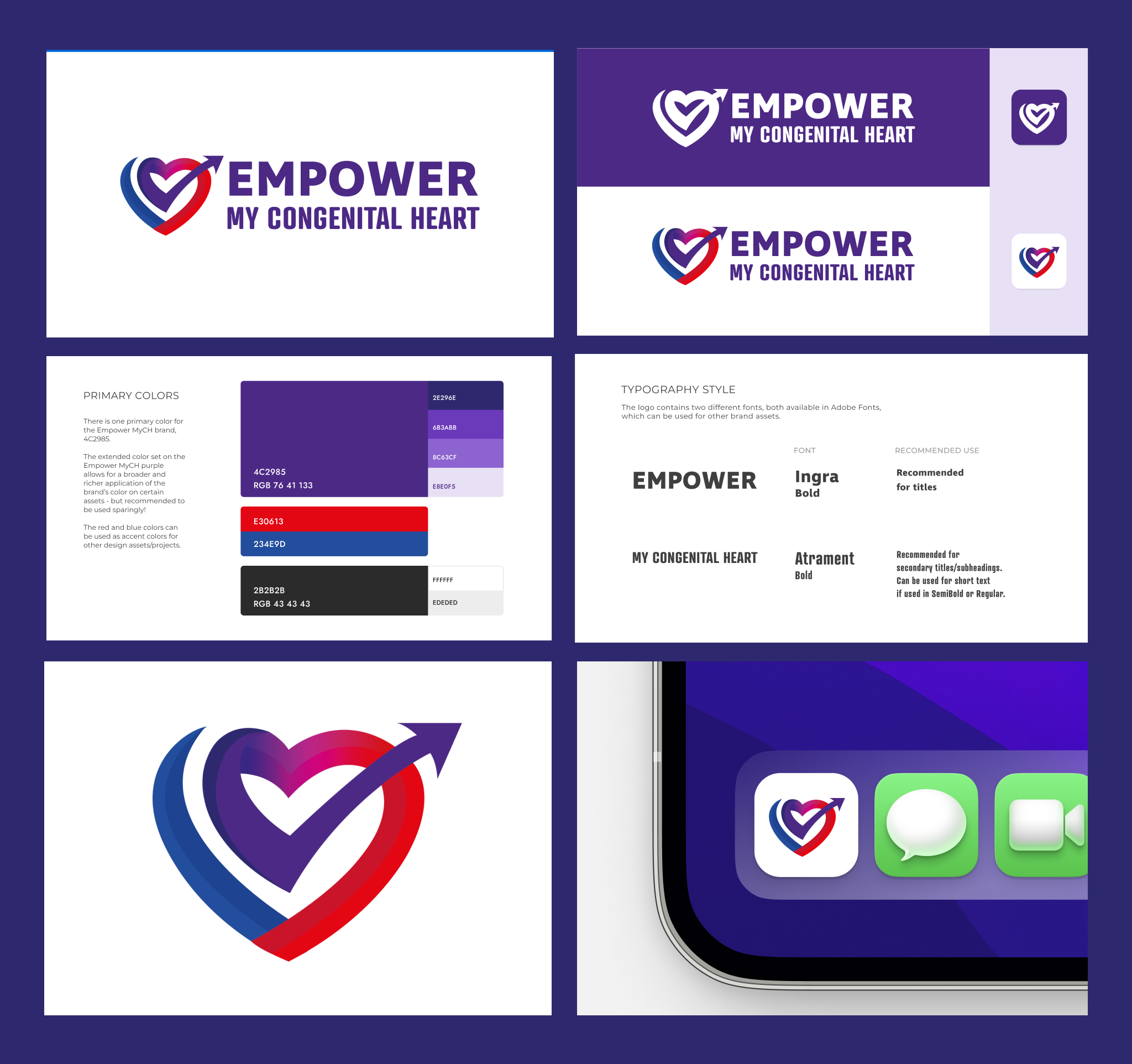
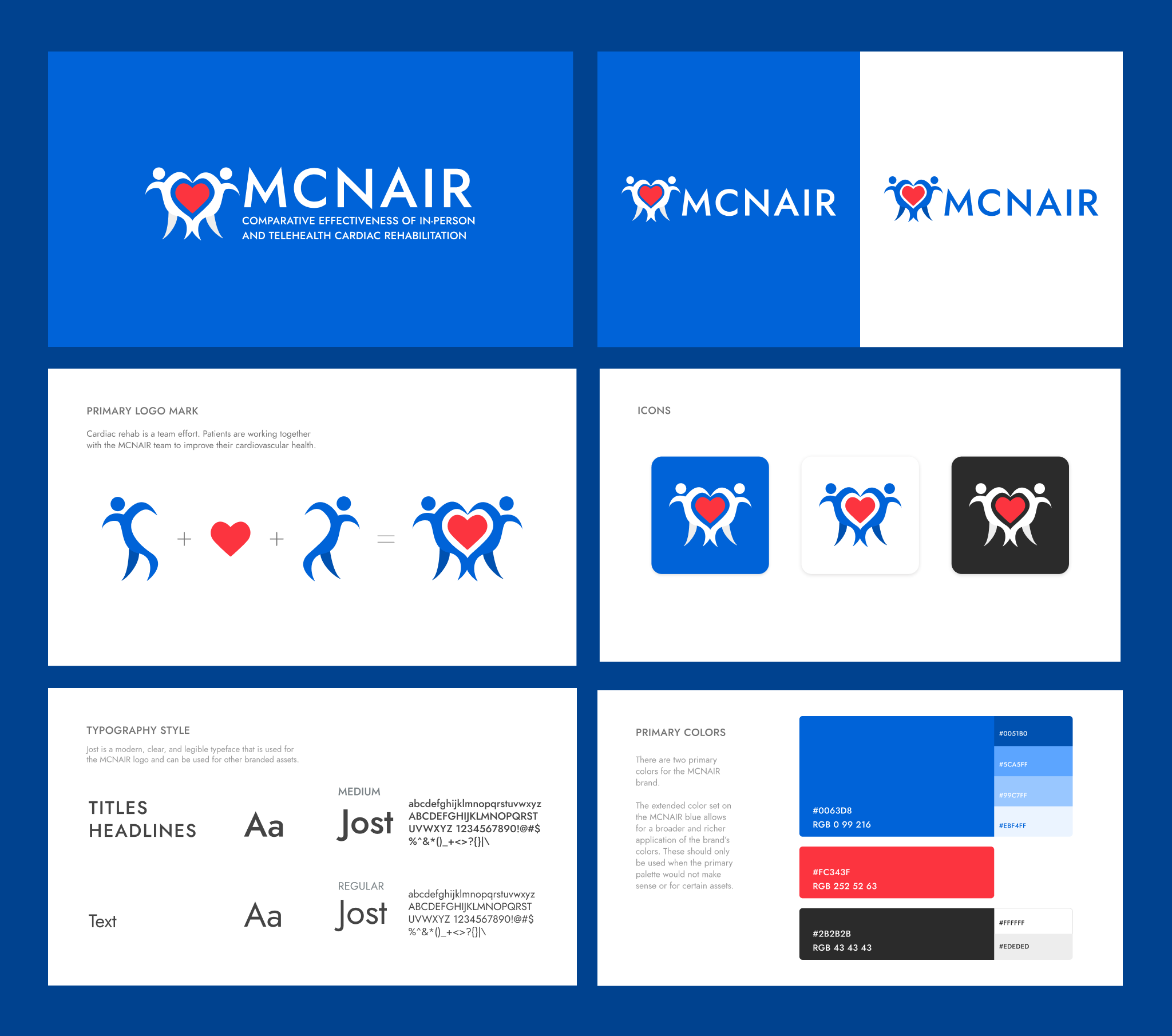
Created brand identities for 8 new medical research studies partnering with UCSF’s Eureka Research Platform and responsive components for web and mobile
05. Email Campaigns (a few examples)
Study-specific email campaigns
Eureka Platform Monthly Emails


