Context.
I was lucky to have worked directly with the talented small business owner of SÄQ. The client and I met several times over two months to discuss and brainstorm SÄQ’s brand and visual identity. I created
SÄQ’s first e⁃commerce site, improving the shopper experience and sale conversation rates.
DURATION 8 weeks , June - August 2022
TOOLS Figma, Maze, Photoshop
TEAM Individual, Client Project
DISCIPLINE UX/UI, Visual/BrandDesign
OVERVIEW
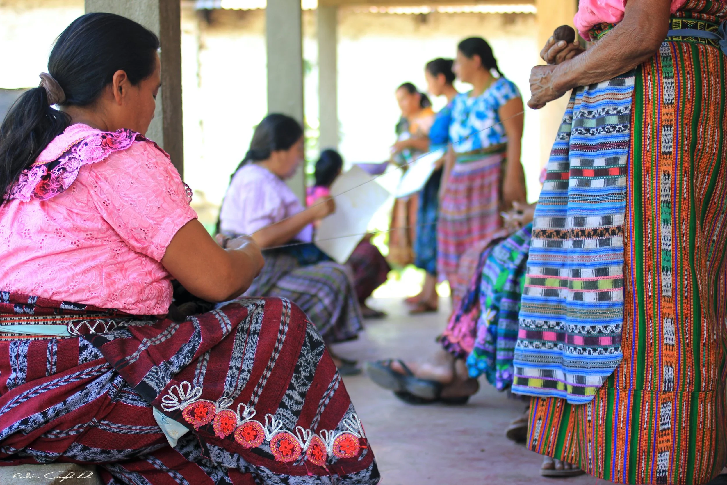
SÄQ is a Guatemalan owned small business selling artisanal, handmade Guatemalan products.
The business is rooted in partnering directly with artisan families in Guatemala and showcasing their beautiful work while providing them with fair and sustainable income opportunities. The brand launched in 2020 through Etsy and has since grown. The client wants to have a more formal digital storefront aside from its already existing shop on Etsy, primarily to maximize sales and expand its brand awareness.

The Problems.
Increase brand awareness
The client wants to expand her shop’s presence beyond Etsy and establish a more credible brand through a formal website. Also, some individuals have a hard time finding the Etsy shop link in bio or don’t know how it works.

Streamline the purchasing process
The client received numerous messages from customers who did not want to purchase through Etsy because they do not want to have to create an Etsy account and input all their details just to make a quick purchase.

Increase business profit
Running the business through Etsy significantly cuts the client’s profits due to high seller fees Etsy charges.

The Goals.
Build a responsive e-commerce site for SÄQ that entices users to buy,
makes the purchase process easy for customers
communicates SÄQ’s brand identity and mission
How might we create a site for SÄQ that will increase brand awareness and sales?

Research.
UNDERSTANDING THE MARKET
I wanted to understand SÄQ’s unique position in the market. I focused the competitive analysis on well-known small and large businesses that, like SÄQ, sell artisanal handmade products. I found:
Only half of these six brands communicated their brand mission and impact throughout the site while the other half had small uninspiring or uninformative About pages tucked away in the Footer.
Additionally, majority of these brand’s websites lacked filters or reviews, or their product listings did not have enough product details or pictures.
IDENTIFYING OPPORTUNITIES & GOALS
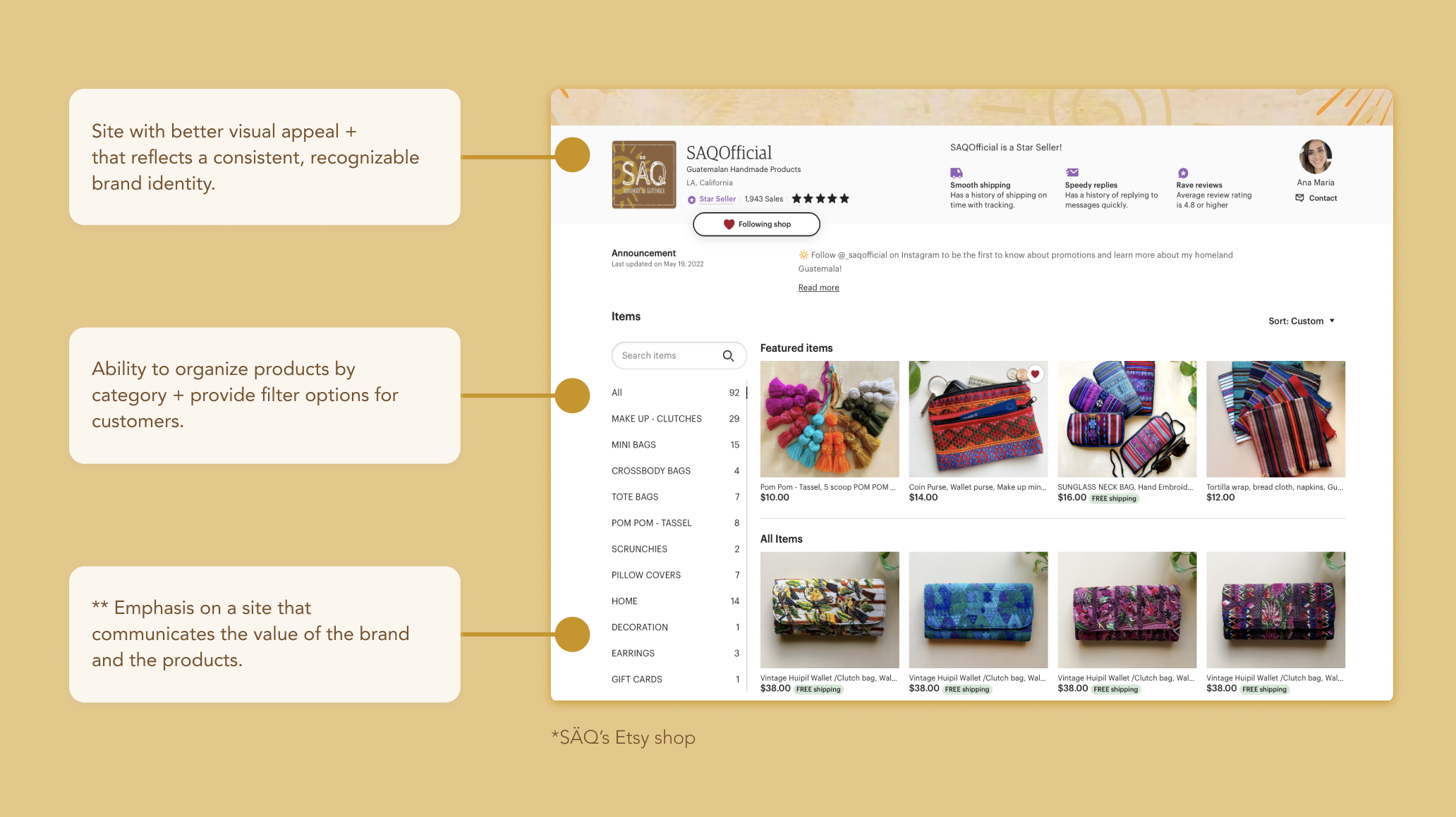
Before starting, I sat down with the stakeholder to discuss what her priorities, goals and expectations for the businesses and the website were. We also identified opportunities for improvement through examining SÄQ’s existing Etsy shop (top priorities listed below).
The client primarily emphasized the need to accurately communicate what the brand is about - visually reflecting and upgrading the already established brand identity, while also communicating SÄQ’s story, mission and value.
USER INTERVIEWS
What do users value in their online shopping experiences?
I interviewed 5 participants between the ages 23-43 about their online shopping experiences, behaviors and preferences. There were two contextual interviews were participants took me through how they shop online. To gather a holistic understanding of users' travel behaviors, the questions asked revolved around the four topics below:
Online shopping preferences
i.e. likes and dislikes of online shopping experiences and web features
Online shopping experiences
i.e. Users gave accounts of their good/ bad online shopping experiences
Factors that deter participants from purchasing
i.e. what pushes users to click off a site or abandon the cart
Importance of knowing the mission/story behind a brand
i.e. asked users to rate/explain importance of knowing a brand
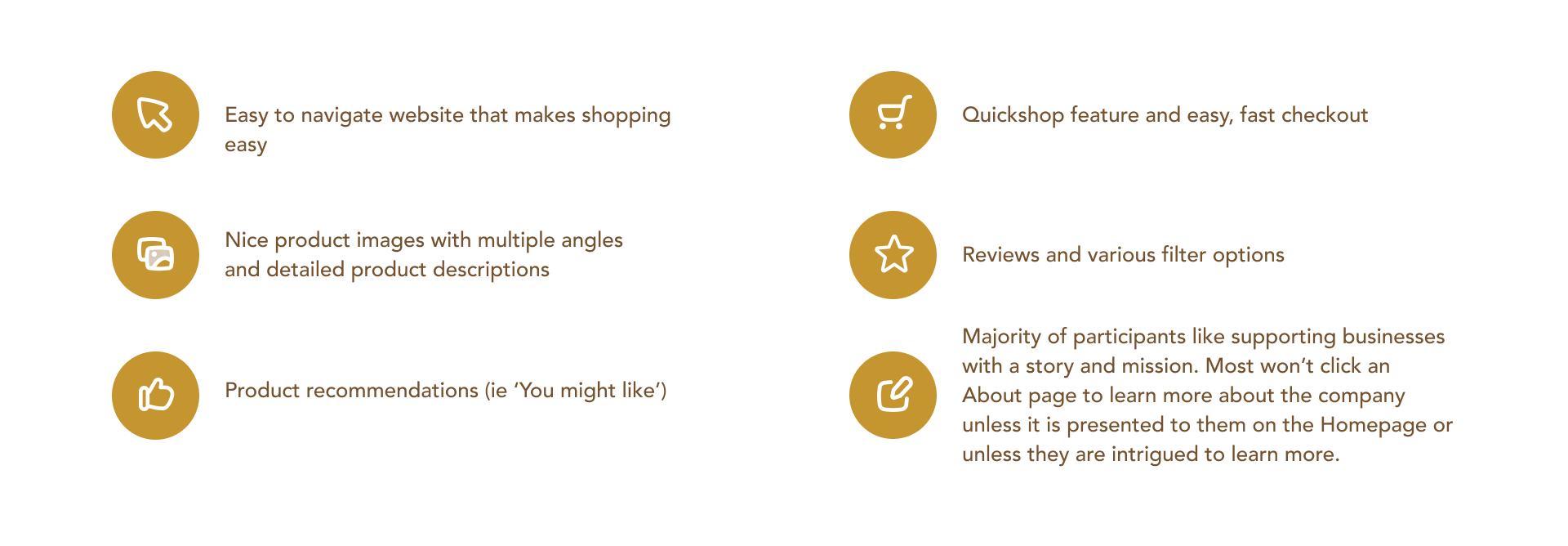
This is what participants emphasized they need and value in their online shopping experiences:
DEFINING THE TARGET CONSUMER
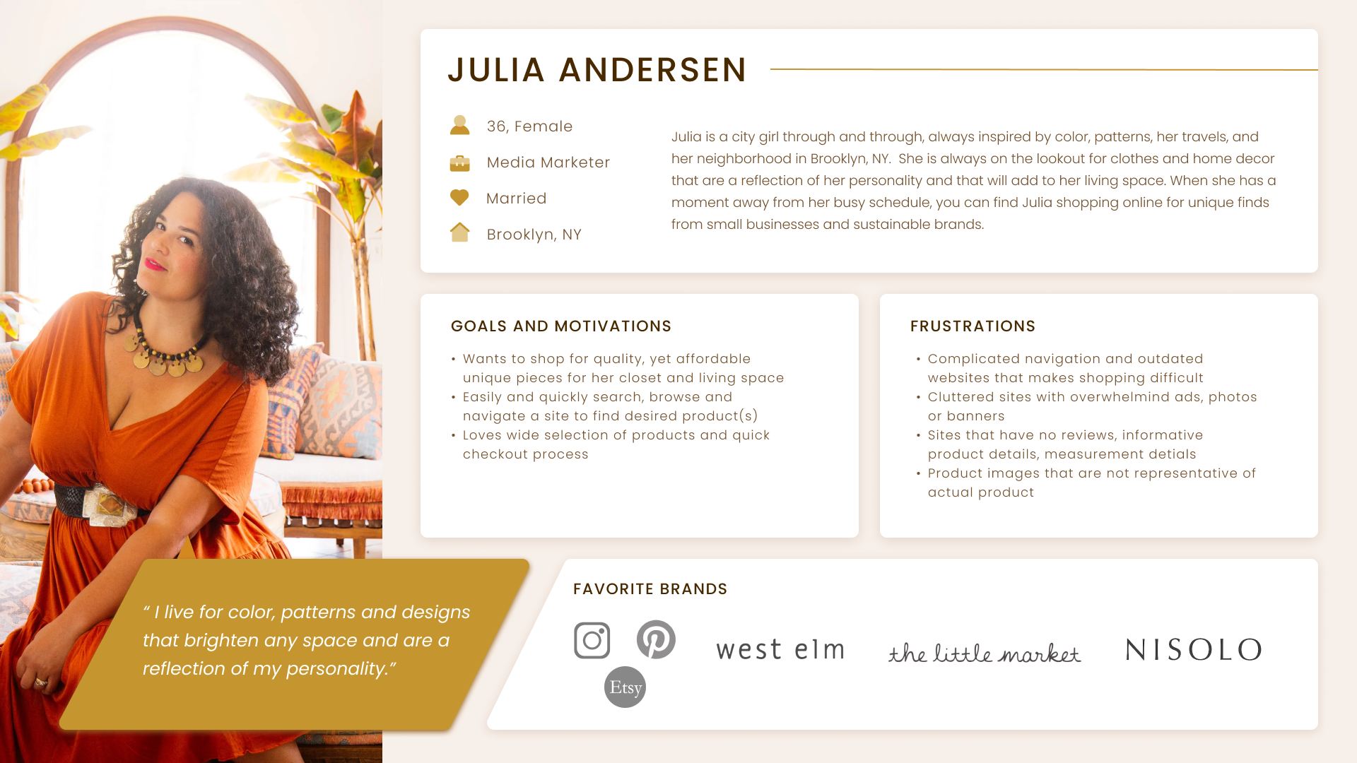
Our key research insights informed how I created a user persona whose goals, needs + frustrations represent the target user group for SÄQ.

Julia loves to dig the Internet for unique, colorful products for her and her home. She loves to shop sustainably + support small businesses.

LAYING THE FOUNDATION
In my initial competitive analysis, I took note of common patterns of site organization. I also examined the types of products SÄQ offered through its Etsy shop to understand how to best categorize everything into a sitemap, while also keeping in mind what the stakeholder wanted.
Ideating.

HOW WOULD USERS NAVIGATE THE SITE?
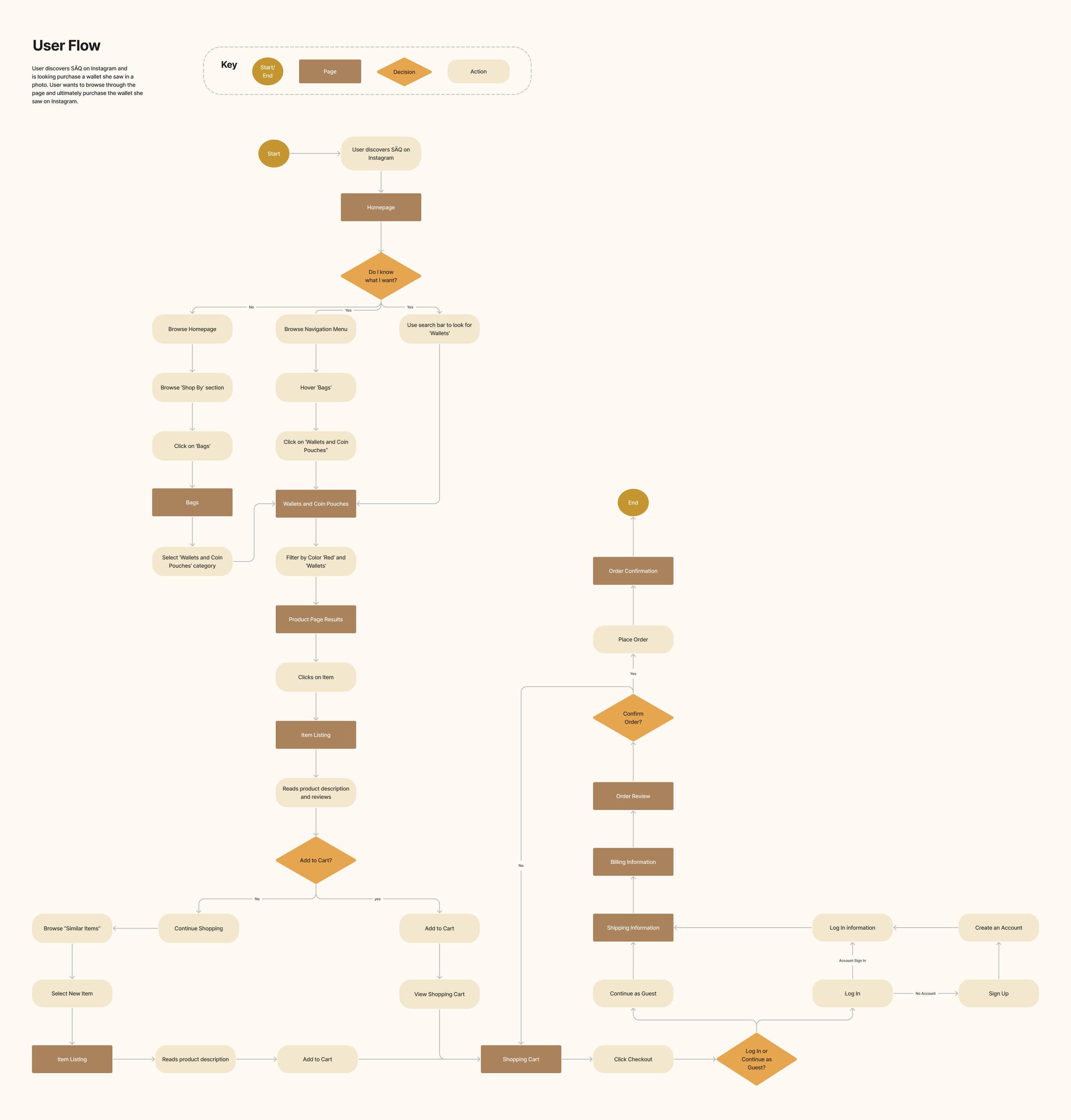
After getting a much clearer understanding of the premises for the new SÄQ site, I created a simple user and task flow to comprehend how users might navigate the site and what pages I would need to create low-fidelity wireframes.
The User Flow explores the navigation flow of a user who discovers SÄQ from an ad on Instagram. The user is intrigued by what they see on social media and are interested in making a purchase through SÄQ’s site. The flow below explores different avenues a user might take when shopping - from browsing the navigation menu, the homepage or using the search bar all the way to checkout.

PRELIMINARY SKETCHES
How can the Homepage communicate what the brand is about while showcasing SÄQ’s products?
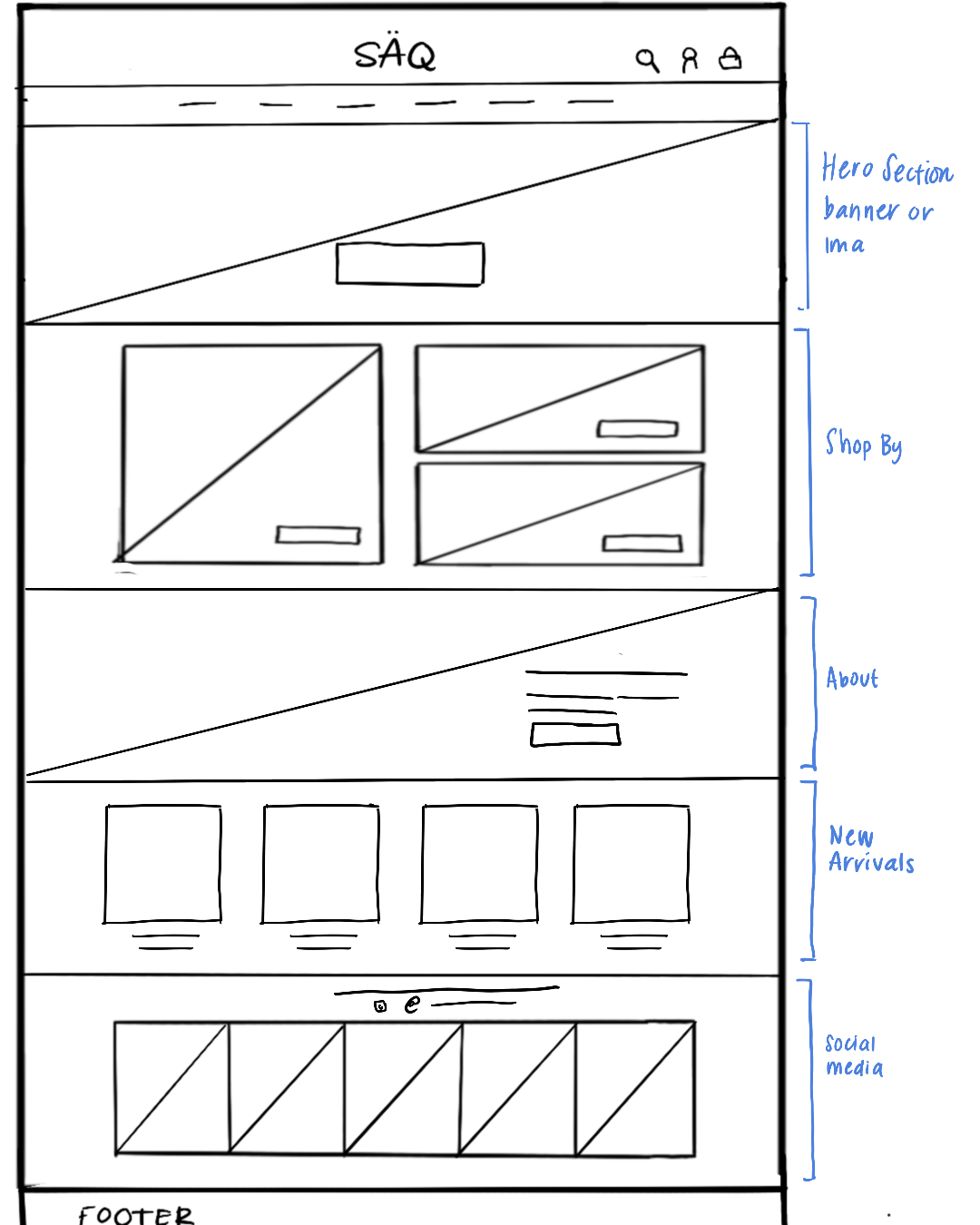
I made numerous low-fidelity sketches of the SÄQ homepage, adding features and sections based off research insights and client preferences. Some things I was mindful of:
Included sections that were highly visual. As research suggested, participants purchase based on visuals they see
To give SÄQ more credibility, it was important to include reviews and sections about what the brand is about. The client and some participants (& potential users) care about the businesses they support. To increase brand awareness and also explain the brand’s value and purpose, it was important to include those sections.
Included social media section to build brand reach and awareness across platforms, increase customer retention and brand visibility

BRAND IDENTITY
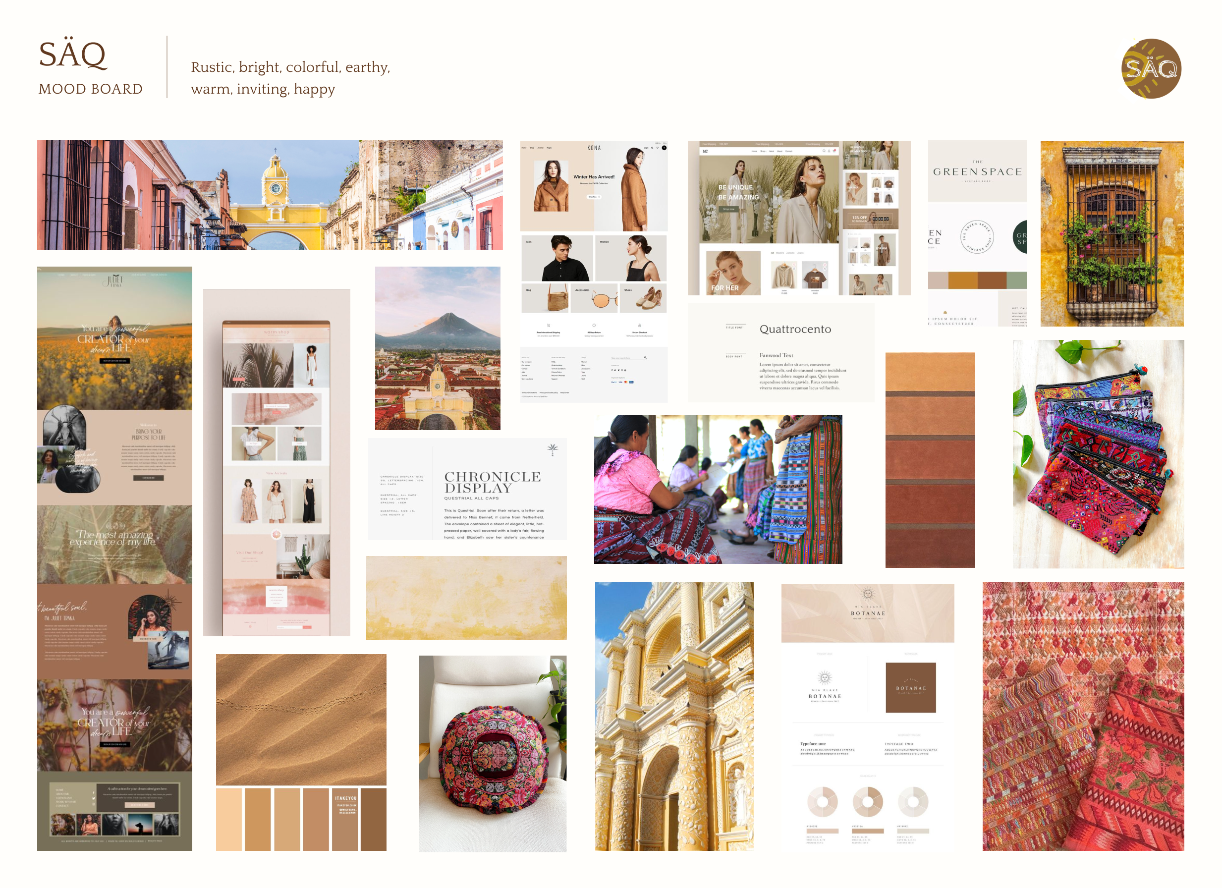
SÄQ is rustic, bright, warm and inviting. I wanted to incorporate texture and warm, earthy tones to balance the colorful textile of SÄQ's products. I also wanted the site to be a representation of Guatemala - the core identity of the the products and the business owner.

CREATING SÄQ’S DESIGN SYSTEM
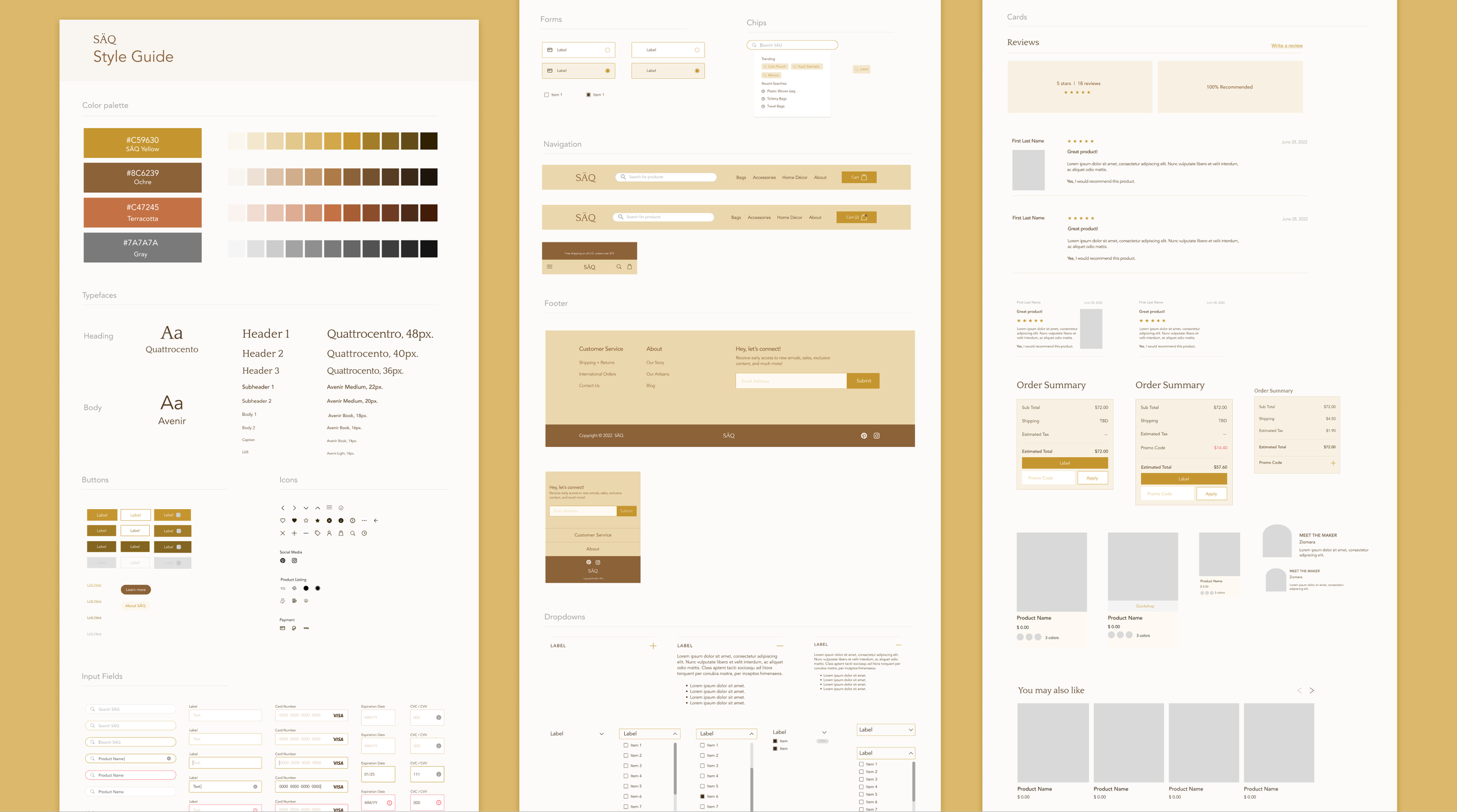
I created a cohesive design system for SÄQ, which includes a style guide and components for the site. I based the colour palette off the existing brand colors the client wanted to keep, and then began creating the rest of the components as I started to build out the mid and high fidelity wireframes. While creating this guide, I was mindful of directly reflecting SÄQ’s warm, inviting, rustic feel.
My design process began by figuring out what to include in this design system, so I researched industry standards for foundational elements and patterns and observed what other e-commerce brands implemented on their sites.
WHAT WOULD THE SÄQ EXPERIENCE LOOK LIKE?
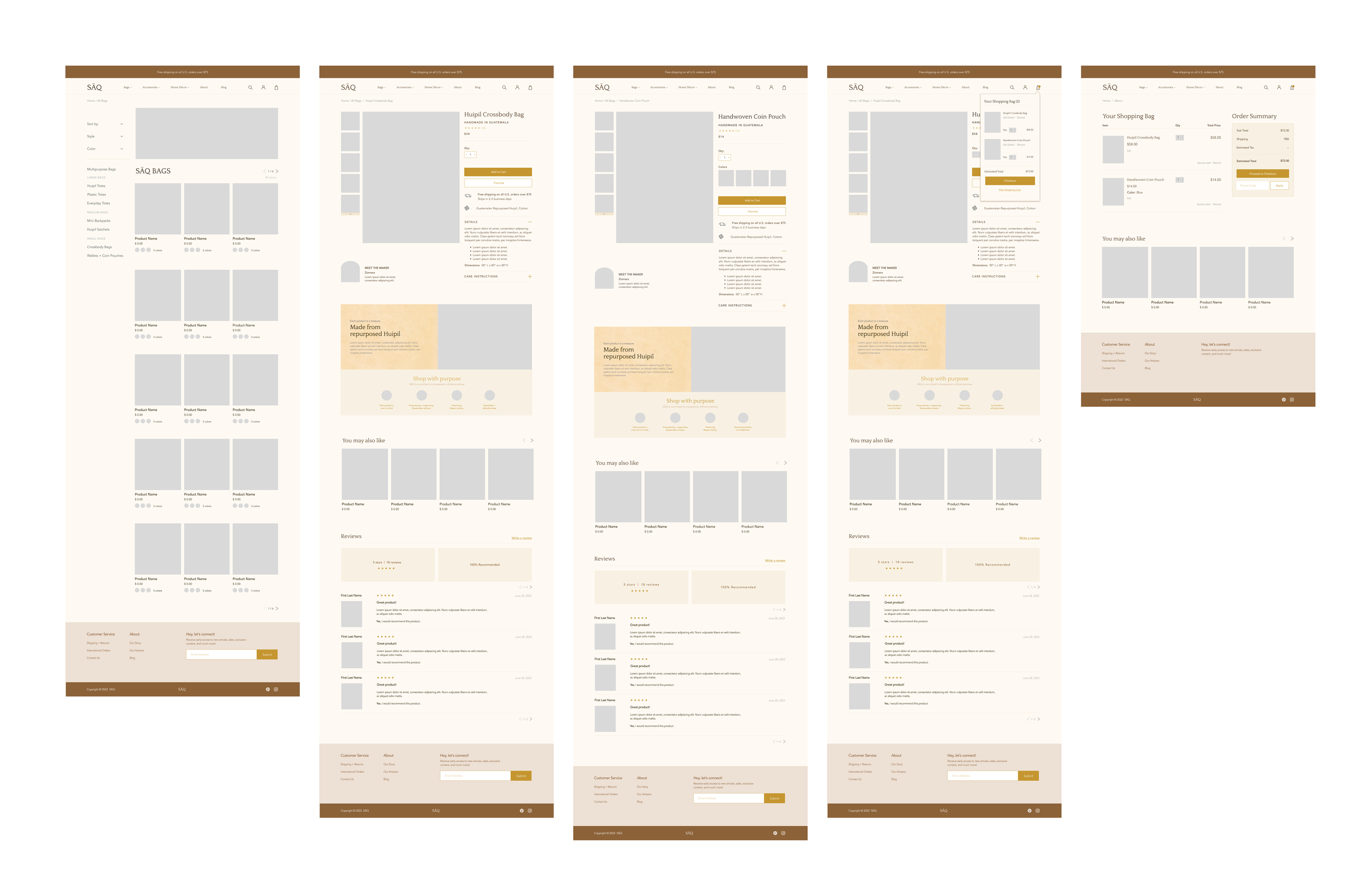
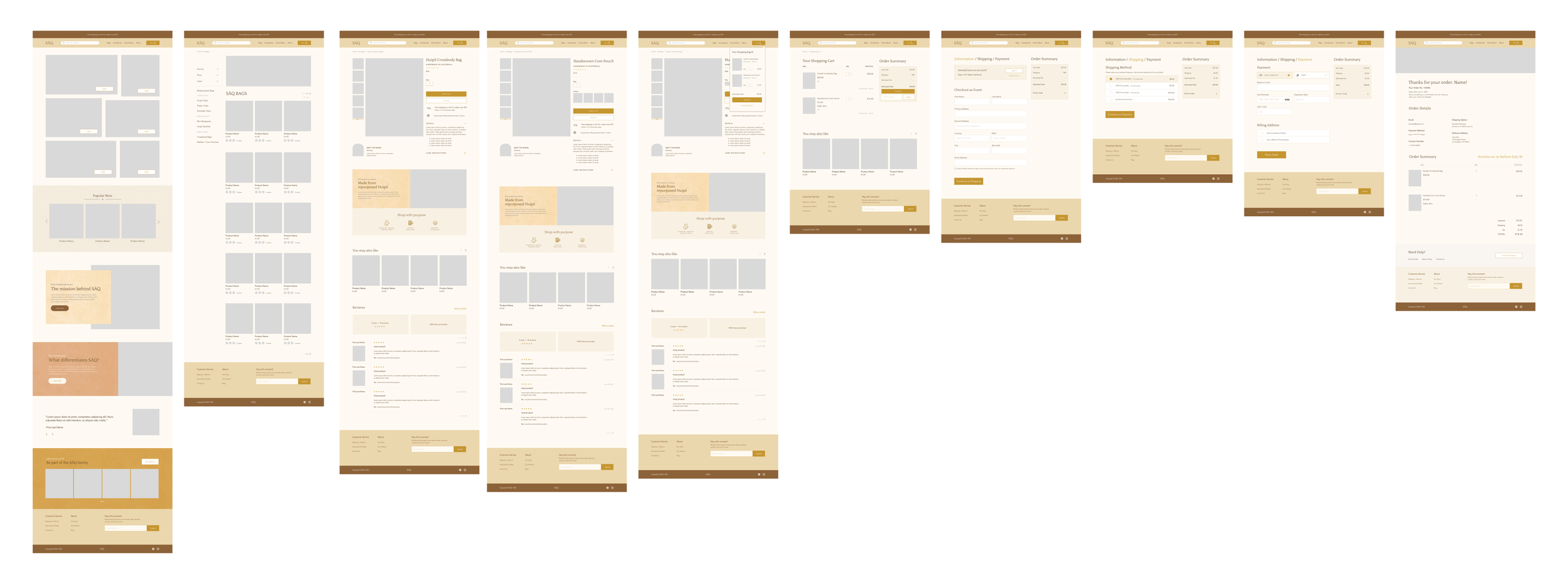
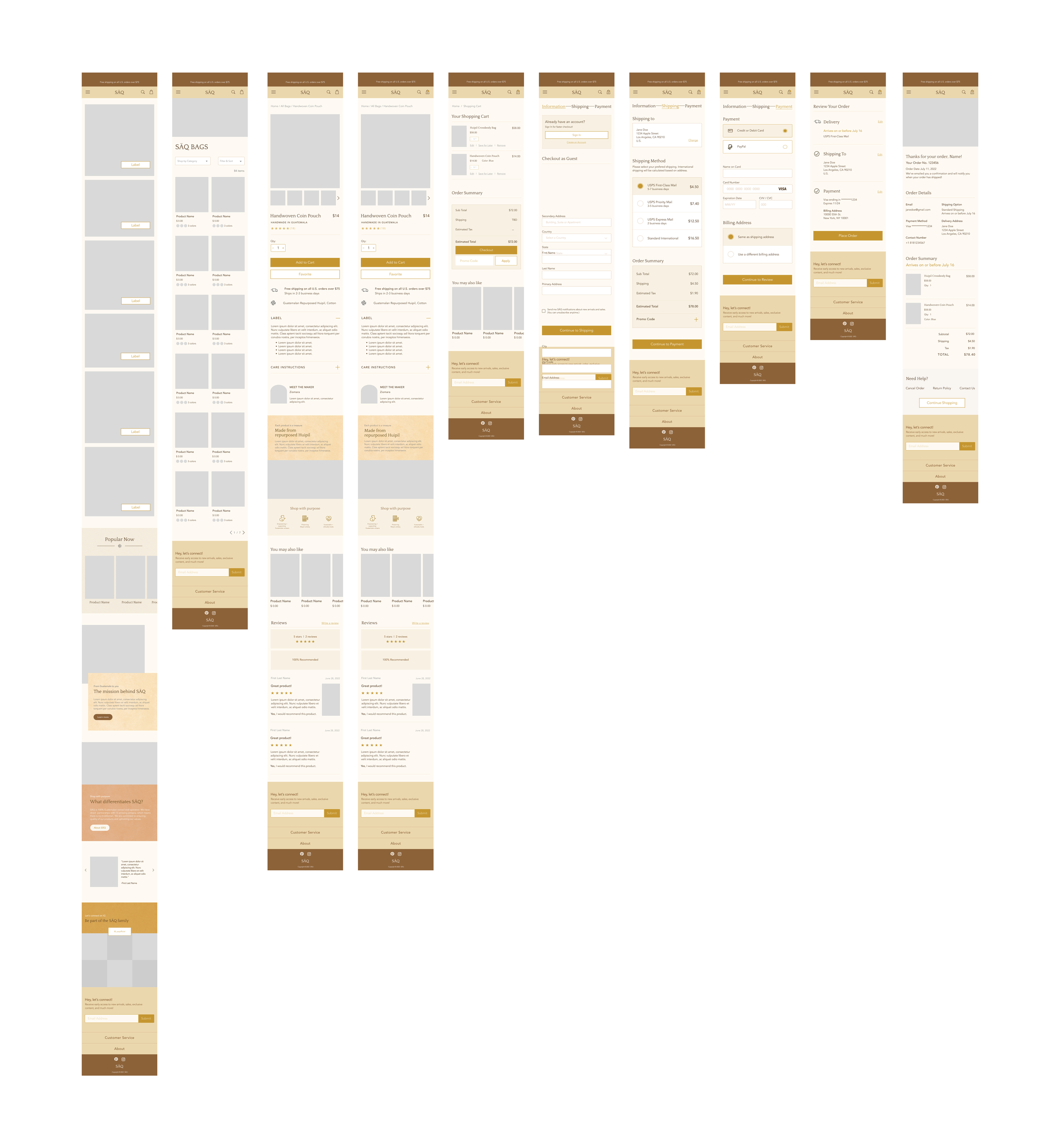
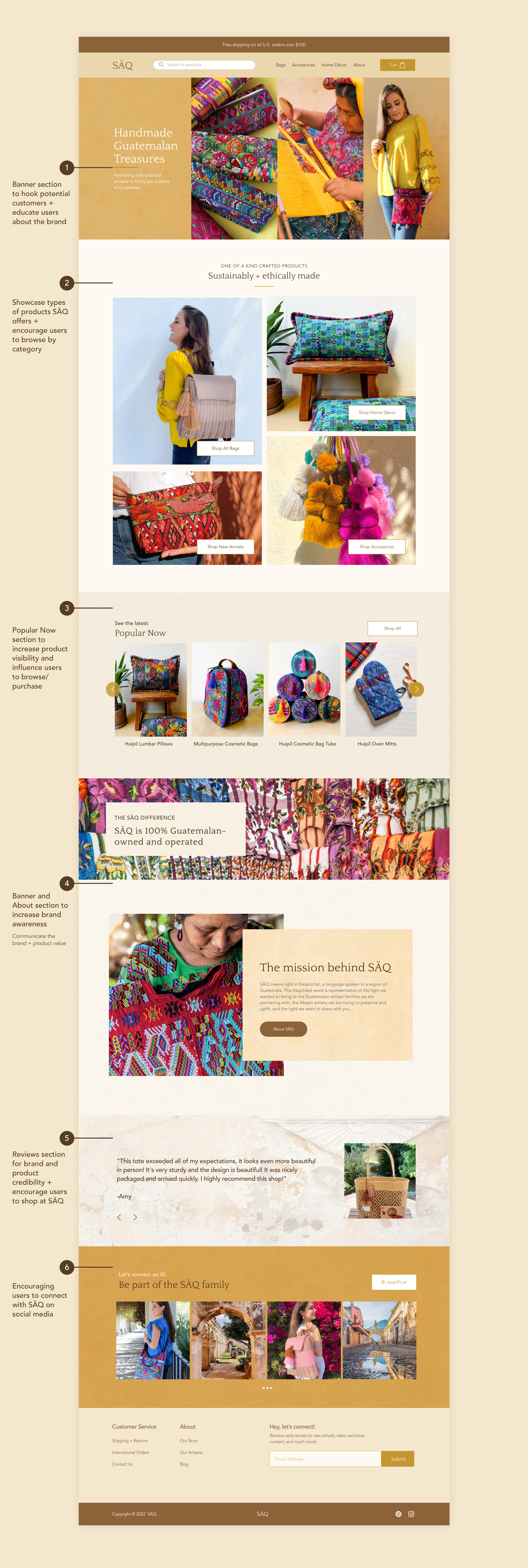
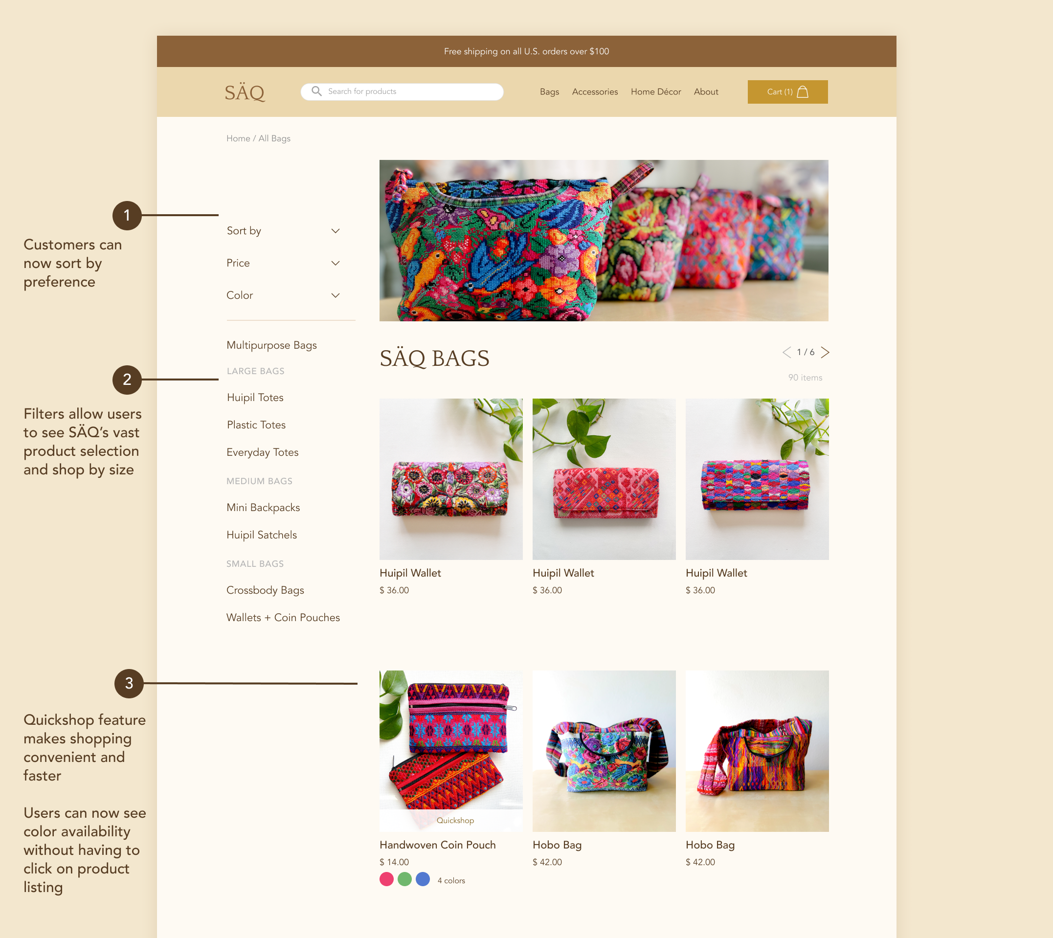
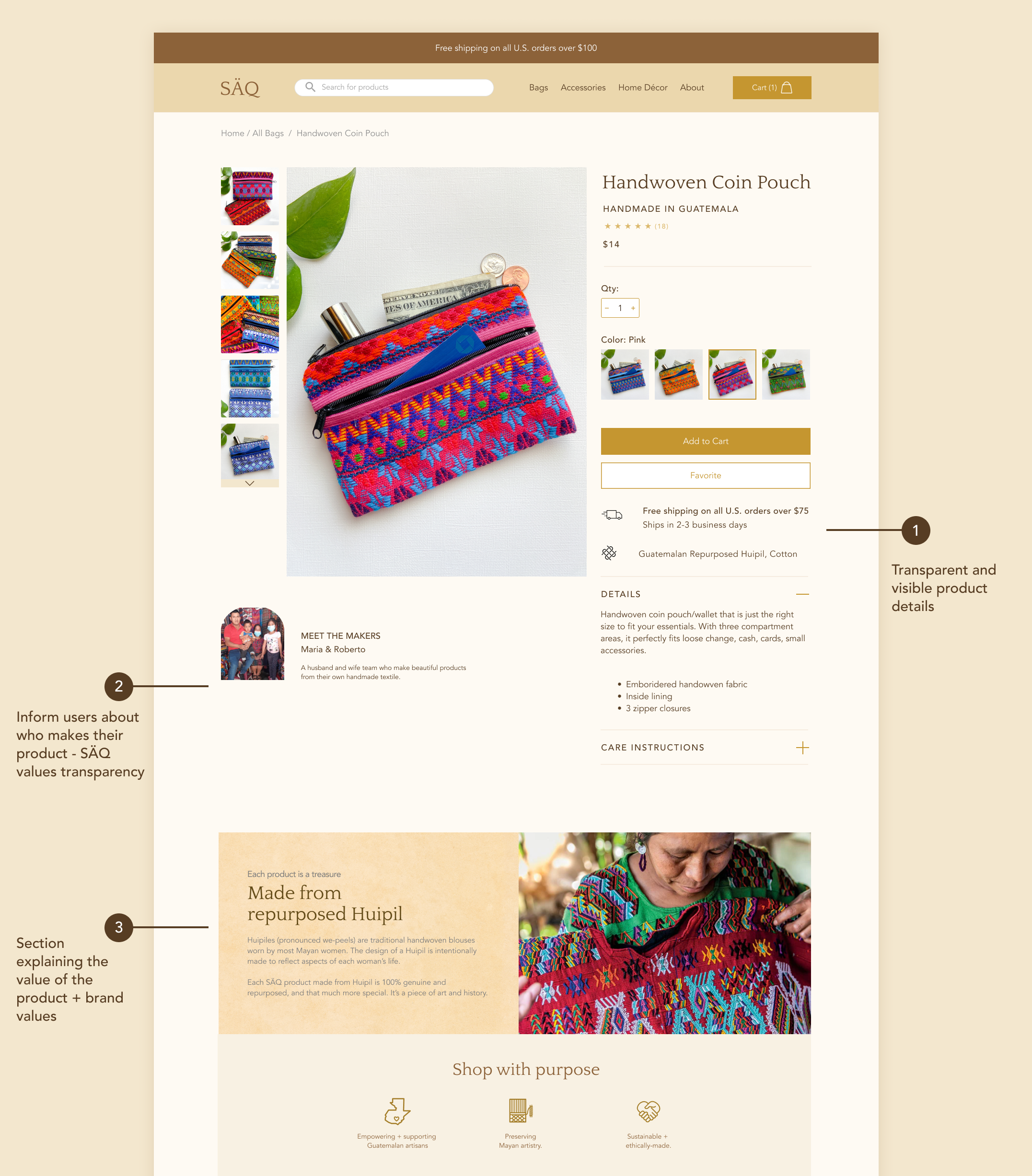
With the style guide at hand, I created numerous iterations of mid and high fidelity wireframes, and created over 24 screens for desktop, iPad and mobile to create a truly responsive site.
See the progress from the first mid-fidelity frames to the final designs below.
What should be prioritized in the making of the wireframes?
I kept in mind both the client’s goals/needs and users’ input gathered from the initial user interviews. There were four main things I kept at the forefront of my mind when creating the final designs:

Emphasize the value of the brand and product
Increase brand awareness and transparency

Make finding and purchasing products easy

Create easy to navigate site with clear brand identity


Testing.
I got 7 individuals of all ages to test out the desktop prototype through Maze. All seven participants went through two tasks successfully, and at the end of the test had to answer a few questions about their user experience.
Objectives
The main objectives are to understand and measure the user interaction, ease of use (from browsing landing page to checkout), and users' ability to complete 2 user flow tasks in the high-fidelity prototype including;
Users’ ability to understand the brand well enough that a customer knows what it is about as well as what makes the brand and products unique
Understand the brand identity and mission, and the core characteristics of the brand and it’s products
Identify whether users are able to make an informed purchase decision
Identifying any pain points or needs in design
Task 1
Scrolling through SÄQ landing page Determine whether users are able to understand what SÄQ is, how it works, and what it offers
Receive feedback about users’ likes and dislikes of the homepage
Task 2
Purchasing ProductsDiscover any confusion or pain points in site navigation from langing page to checkout
Receive feedback about users’ likes and dislikes of each page
Do users feel connected to the brand enough to shop there in the future

FINDINGS
Successes
✔ 6/7 participants successfully completed both tasks. One participant dropped off and only did the first task.
✔ 7/7 of participants had good understanding about the brand after scrolling through the landing page and viewing product listing pages; all participants said there is nothing else they’d like to see on the Home Page or Product pages
✔ All participants had good first impressions with the brand and site
Needs Improvement
Thankfully, there were no major needs for improvement, besides fixing the 'Info-shipping-Payment’ progress bar at Checkout as it confused participants. I edited a few features and details and lastly made sure that the prototype ran smoothly.

TEST THE PROTOTYPE ↓


